“Friend’s Paw” is an e-commerce app for a pet food delivery service.
Friend’s Paw strives to deliver fast, on a convenient schedule, and to save time of their customers. They offer competitive pricing also.
The goal is to design an app that allows users make orders easily and fast.
Friend's Paw customers are owners of one or more pets.
Design Thinking Process is being used as a framework.
Challenges and constraints I’ve met at the beginning of the project (another challenges were discovered later):
it takes too much time to choose food for your pet and calculate the amount of packages.
time spent increases proportionally with the number of pets.
I’ve conducted interviews and created empathy maps to understand users needs, feelings, and thoughts better. A primary user group confirmed initial assumptions about Friend’s Paw customers. But the research also revealed that saving the time is not the only important factor for users.
So the next Pain Points were found out at that time:
Time
Calculating and understanding of how much pet food to order takes too much efforts and time.
Memory congestion
People forget to order something occasionally, especially if pets have differences.
More pets = More spending
Having another family member always means an additional cost.
Accessibility
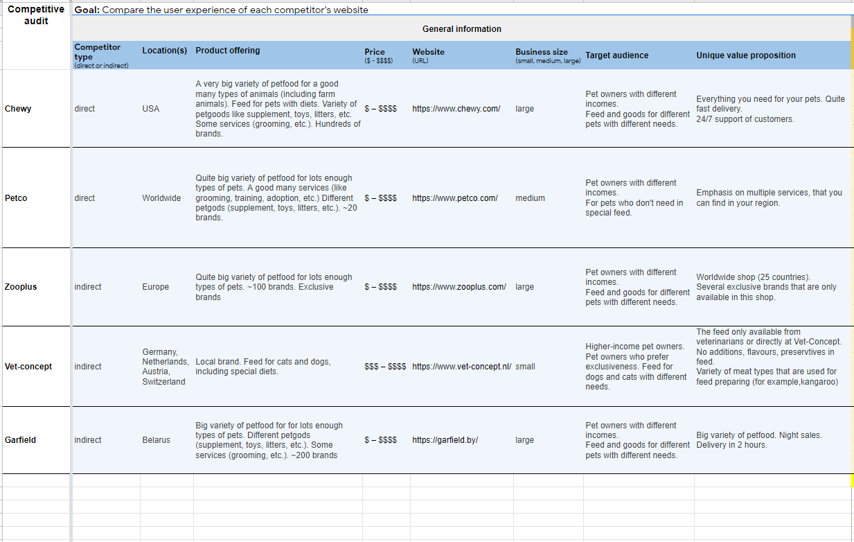
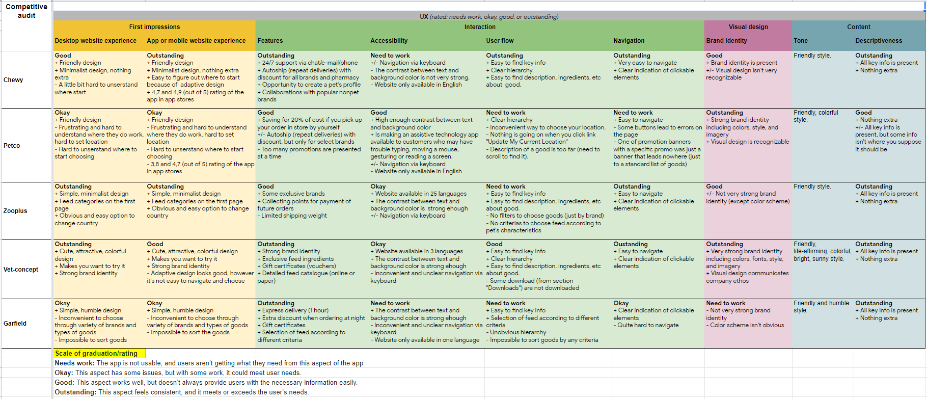
Our conducted competitive audit shows that some pet food delivery platforms are not equipped with assistive technologies.
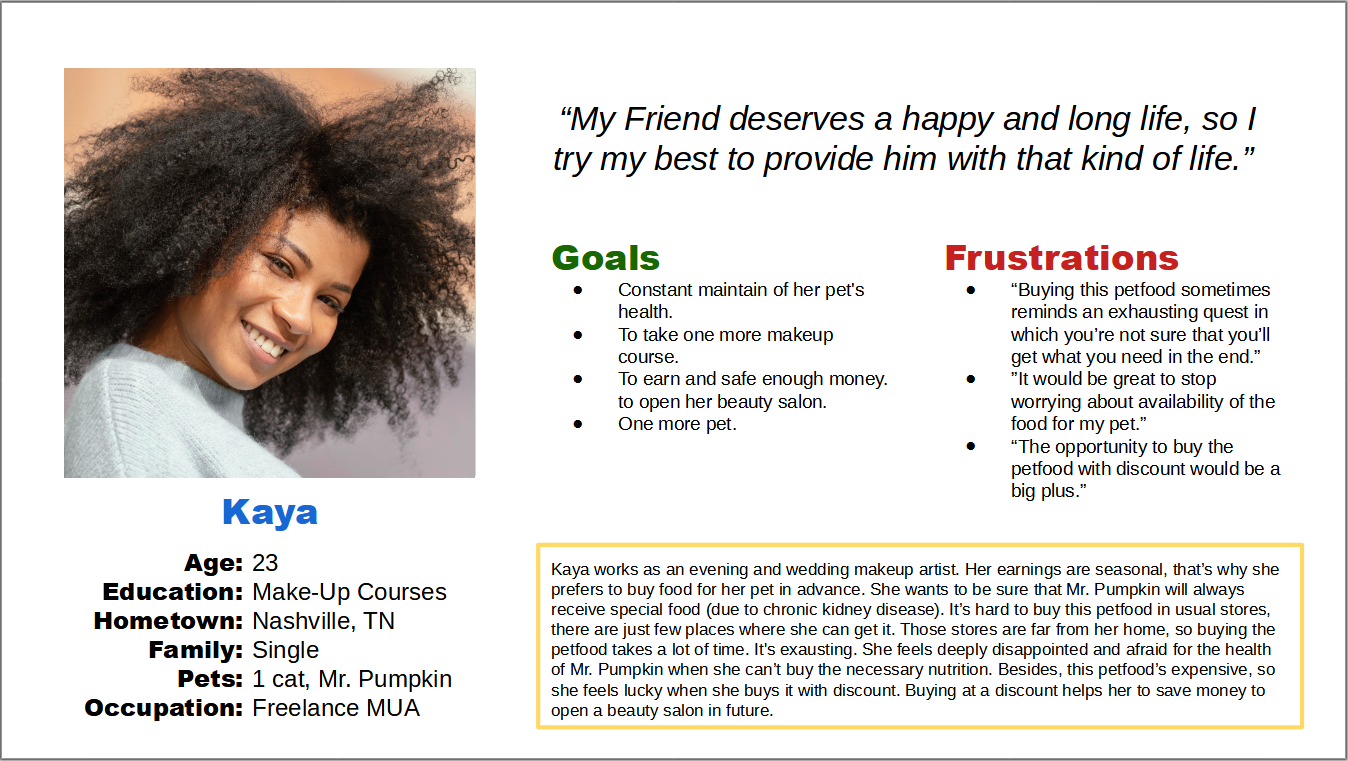
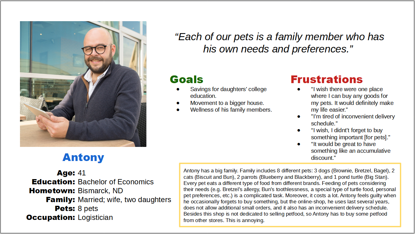
Personas (Kaya and Antony) based on the research:
To ideate and understand better challenges our user meet when they calculate an amount of feed, some additional instruments (like Storyboarding and User Journey Map based on Kaya’s Persona) have been used:
The conducted competitive audit and its results (take a closer look at the sheet):
For initial design concepts I usually draw at least 5 paper wireframes (sketches) for each screen, then combine parts, and try to make the best variant:
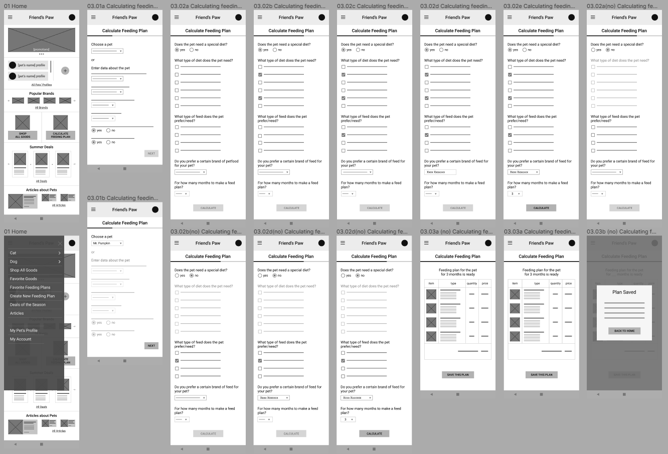
First digital wireframes based on the sketches (try the low-fidelity prototype with them):
We’ve conducted an unmoderated usability study with 5 participants using the lo-fi prototype. The responses have been charted and analyzed:
Finding #1
Home-page was overloaded.
Finding #2
Pet owners wanted an opportunity to specify several pet food brands.
Finding #3
The calculator flow was tangled.
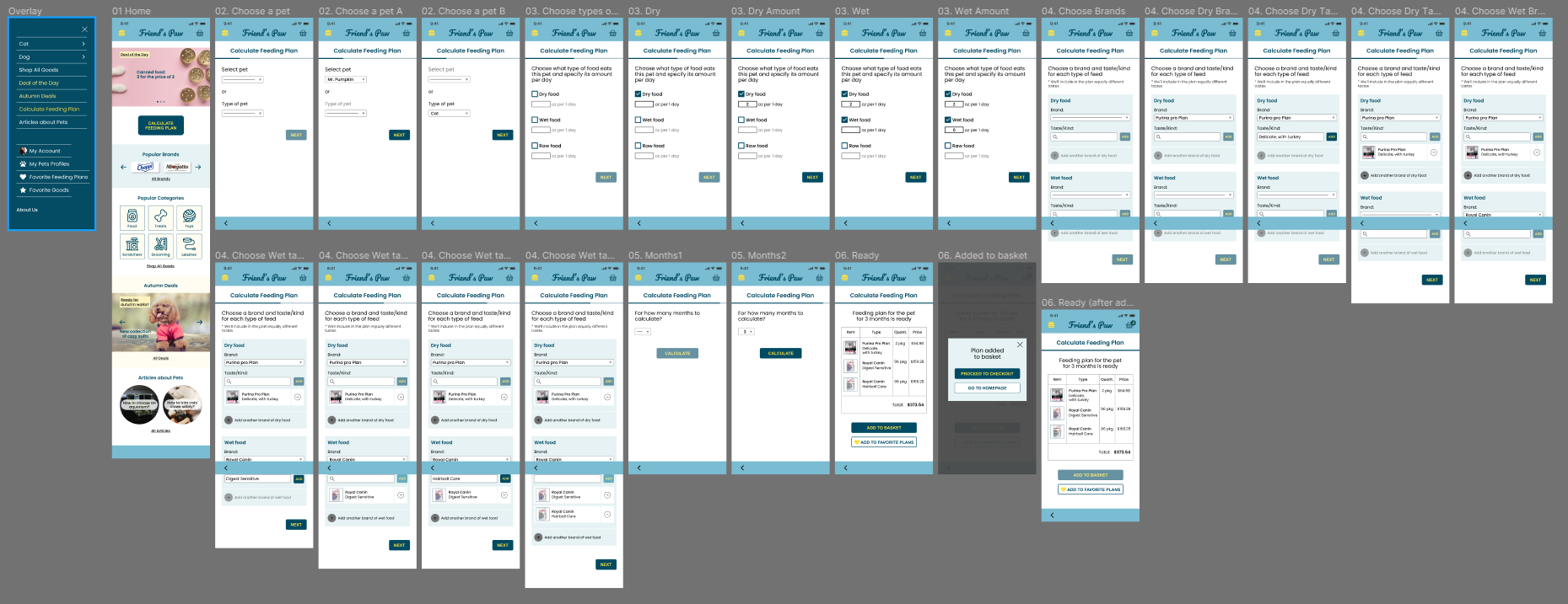
Then the usability study insights were prioritized and applied. The wireframes were transferred to polished mockups. A high-fidelity prototype was created based on the mockups.
Try the high-fidelity prototype.
What I have learned through the design process:
Emphasizing and placing user front-and-center are very important.
Conducting usability study provides very useful insights about a product.
Paper wireframes is a great finding for me as a newbie in UX design.
Next steps:
To design “Proceed to Checkout“ flow, conduct a usability study via lo-fi prototypes, add some necessary changes.
To create mockups based on wireframes, conduct a usability study using hi-fi prototypes, and add some necessary changes.


